r00ted
-
Giving farmers the power to understand and manage their farm with technology
Background
In fall of 2023, I took the a 3000’s UI Design class where we had full autonomy to build a project. I wanted to make a project based on a problem space in open source projects I noticed. From this, r00ted was born.
Timeline
Aug - Dec 2023
Role
Researcher
Designer
Prototyper
Tools
Figma
Miro
Disciplines
Human Interface Guidelines
Interaction Design
Visual Design
1. Introduction
Farming is historically pretty hard. You have to have knowledge of chemistry, business management, mechanics, zoology, and manual labor.
No wonder 37% of people say they can't keep an indoor plant alive.
Published by Statista Research Department, and Dec 1. “How Many Indoor Plants U.S. Gardeners Kill a Year.” Statista, 1 Dec. 2023,
Link
The main challenge in farming is the lack of knowledge about what's going on under the soil and the steep learning curve for plant care.
However, in recent times, there has been a rise in independent home farming and CSAs (community-supported agriculture). This has motivated both experienced and new farmers to find innovative ways to enhance their skills, and technology is one such way they are turning to.
Research
Market Research
And I've been thinking about this for a while, how could we use technology to make plant
care easy and accessible? My first thought was immediately sensors, but there are tons of
sensors already.
The main problem with sensors on the market is they are:
Low-Quality
I read tons of reviews saying the technology gave out on them in a few weeks or were not built for the environment they advertised
Too Expensive
Sometimes the quality shows in these prices, you can generalize it at:
Sensor Price: $30 > Most likely surface level and not gonna last
Sensor Price: $60 > It was often overpriced for the few capabilities it had or much too complicated for the simple job I need.
Surface-Level
The products were often too simplistic and unable to integrate with other platforms, which impeded scaling and customization.

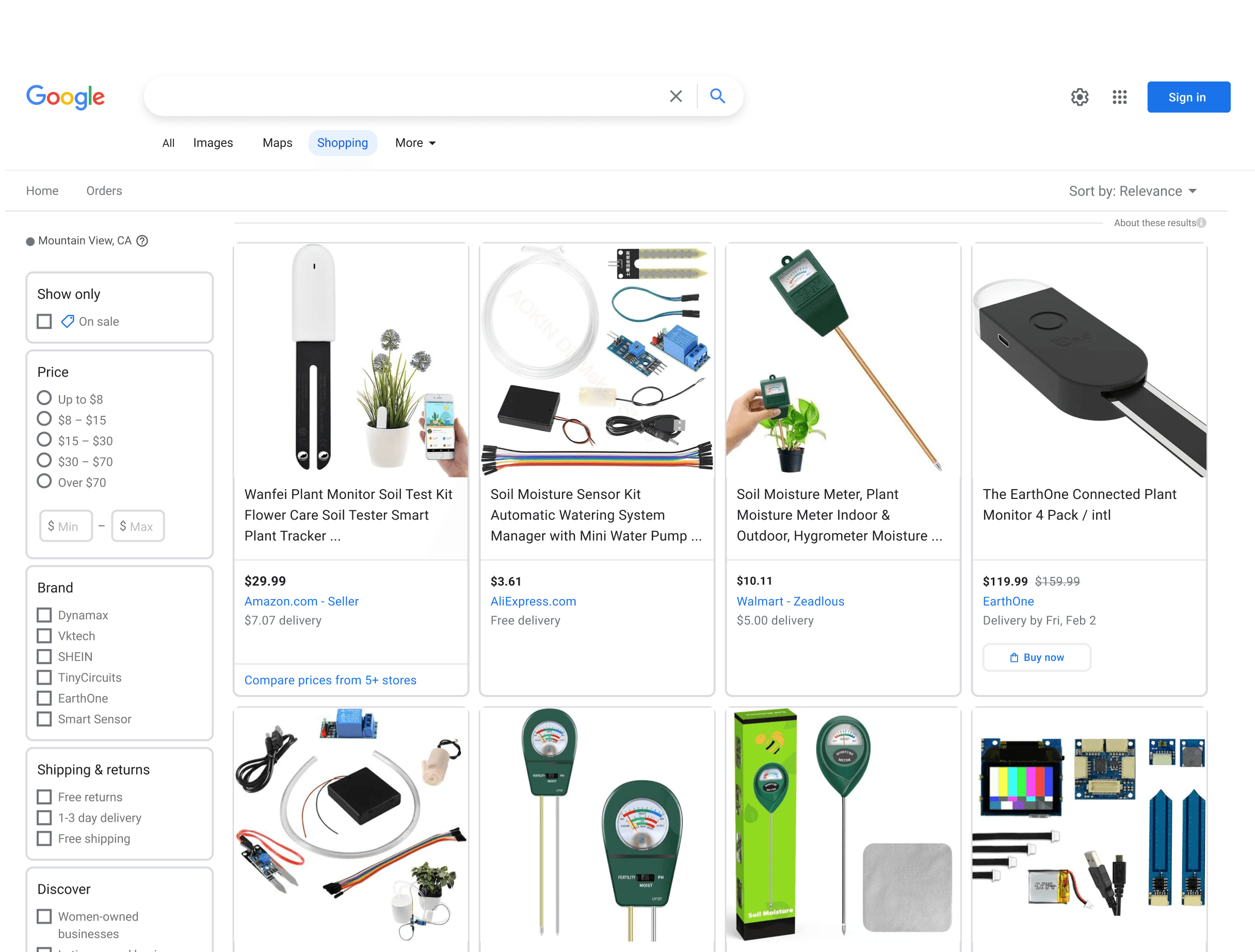
Amazon and Google
Academic
Because I couldn’t find anything on the market, I opted to look if there was any suggestions in academia.
Researchers over at the University of California, Davis tested out a concept that fell in line with my thinking and verified that the concept could work. But I noticed that their solution also had a UI that was not able to be upgraded easily, easily customized, and difficult to understand for non-experts. Thus leading me into designing a new format for this technology
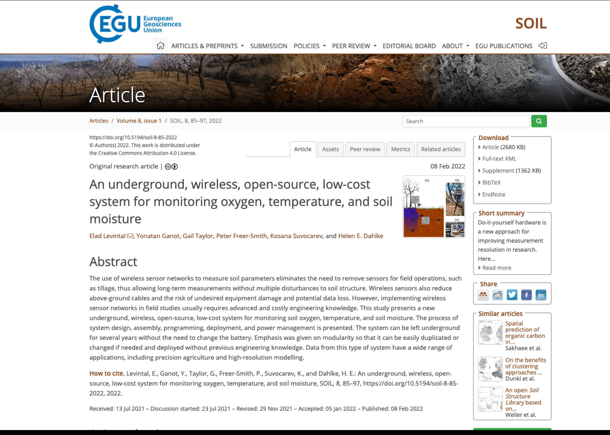
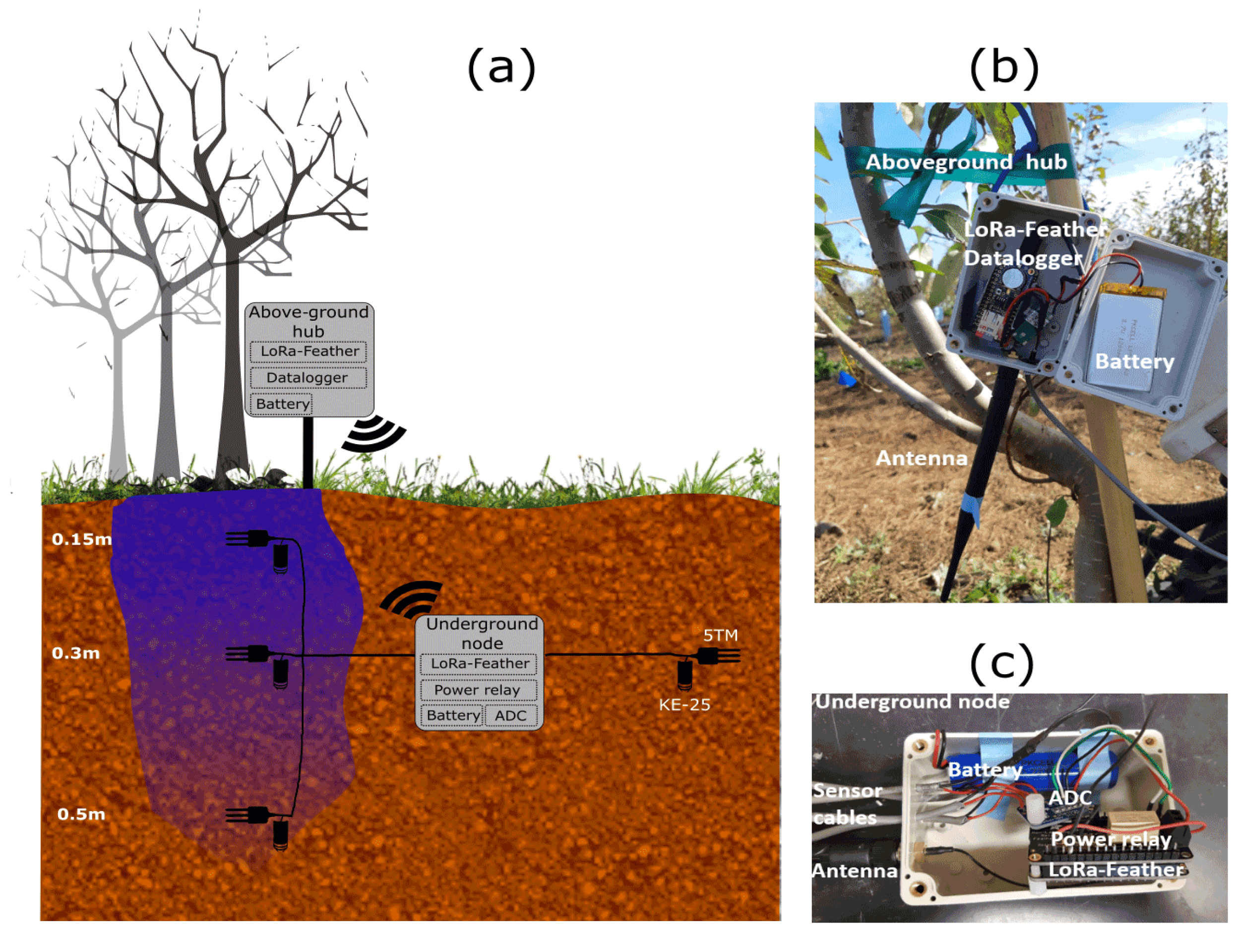

Levintal, Elad, et al. “An Underground, Wireless, Open-Source, Low-Cost System for Monitoring Oxygen, Temperature, and Soil Moisture.” SOIL, Copernicus GmbH, 8 Feb. 2022, soil.copernicus.org/articles/8/85/2022/. Accessed 03 Feb. 2024.
Link
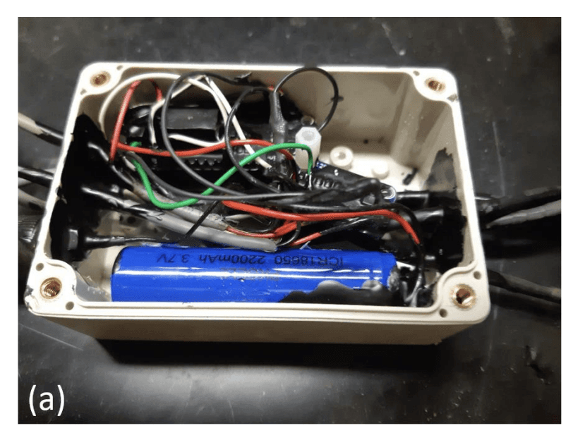
The Hardware Setup:
A mini computer acting as a hub receiver above ground
And an underground mini computer with sensors
The readouts or the only real UI for the whole system
Product Requirements
From this I was able to put together a few product requirements for improvement:
Easily Accessible
The parts need to be primarily widely available and affordable, otherwise no one would be able to access them and we would be contributing to a lot of e-waste
Highly Customizable
No two fields are the same, each farmer has own unique needs. Therefore, the system should allow farmers to add new components to their system to suit their needs.
Easily Understandable
It also needs to help them understand and share this data, so they can make informed decisions and improve their yields
Local & Mobile Data
The data needs to be completely owned by the user, while still being portable. The user needs full control at all times without worrying about their data being misappropriated.

Brainstorming
Sketches
With my requirements down, I got straight into sketching, I wanted to the experience to feel identifiable, something like a game dashboard but where you could pick on information instantly.

First Round
I thought these health sliders would really help with that. I played around with 3D map to explore almost like Google Earth with droppable components (Like a raised bed, piping, etc.). But it needed work, these later came in different form in the design.
After showing this to my classmates and professor, a common question that really lingered was:
“Ok...but what do I do with this?”
People were really confused with what the data could do, how to apply it, and why it’s even important to capture it. I needed a solution that made the decision making process easier. Instead of having to manually interpret reasoning, people wanted an explanation.
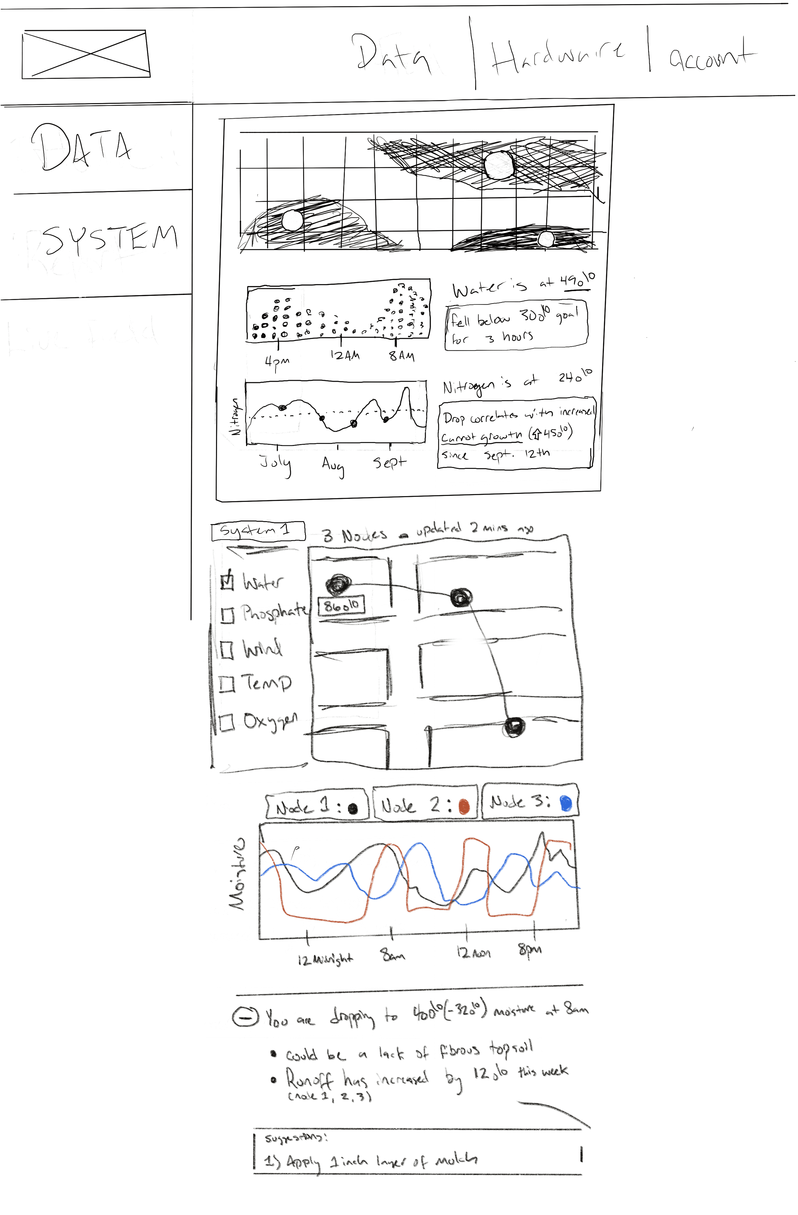
Second Round
I fleshed out the map a little more from a 2D perspective, and added in the concept of nodes and a hub.
Each node would send data back to the hub and be more focus on capturing one distinct metric.
I also thought about how I could make still use that “editable” drag and drop component system. This lead me to think about adding filtered view for specific use cases.
Finally I added a sort of Suggestion Box, something to make sense of all of the data and show you the effects it has on your farm

Third Round
So I got to reworking the design, this time in a more traditional web platform. I started thinking about the essentials that you would need when using this platform and what the user wants out on the field.
Core Requirements
A place to add/edit hardware
A place to capture and read data
Ways to understand what the data is saying at a glance
I believed I had the last 2 two down but not really the first one. Honestly it was daunting because I had no idea what to do.
I’ve never worked on hardware before, so designing for it was going to be challenge. But I followed my training here and fell back on my requirements and research here. I started collecting inspiration on are.na and took notes of what I am looking for.

My Requirements: Hardware
The study’s design required a hub and nodes, so we can analyze that for improvements.
First it would be nice to be able to add parts without having to solder stuff on every single time.
Modular
Needs to be customizable, able to change, come apart & easily put together.
Second it would be nice to add more sensors than just temperature and humidity or whatever’s onboard. Alot of sensors, How would we do that? well we need a place because its modular we could just add on any new sensors on easily.
Work with a variety of Sensors
I want to be able to plug and play sensors, making replacements/customizing so easy. The average person shouldn’t have to solder the board themselves just to get teh temperature
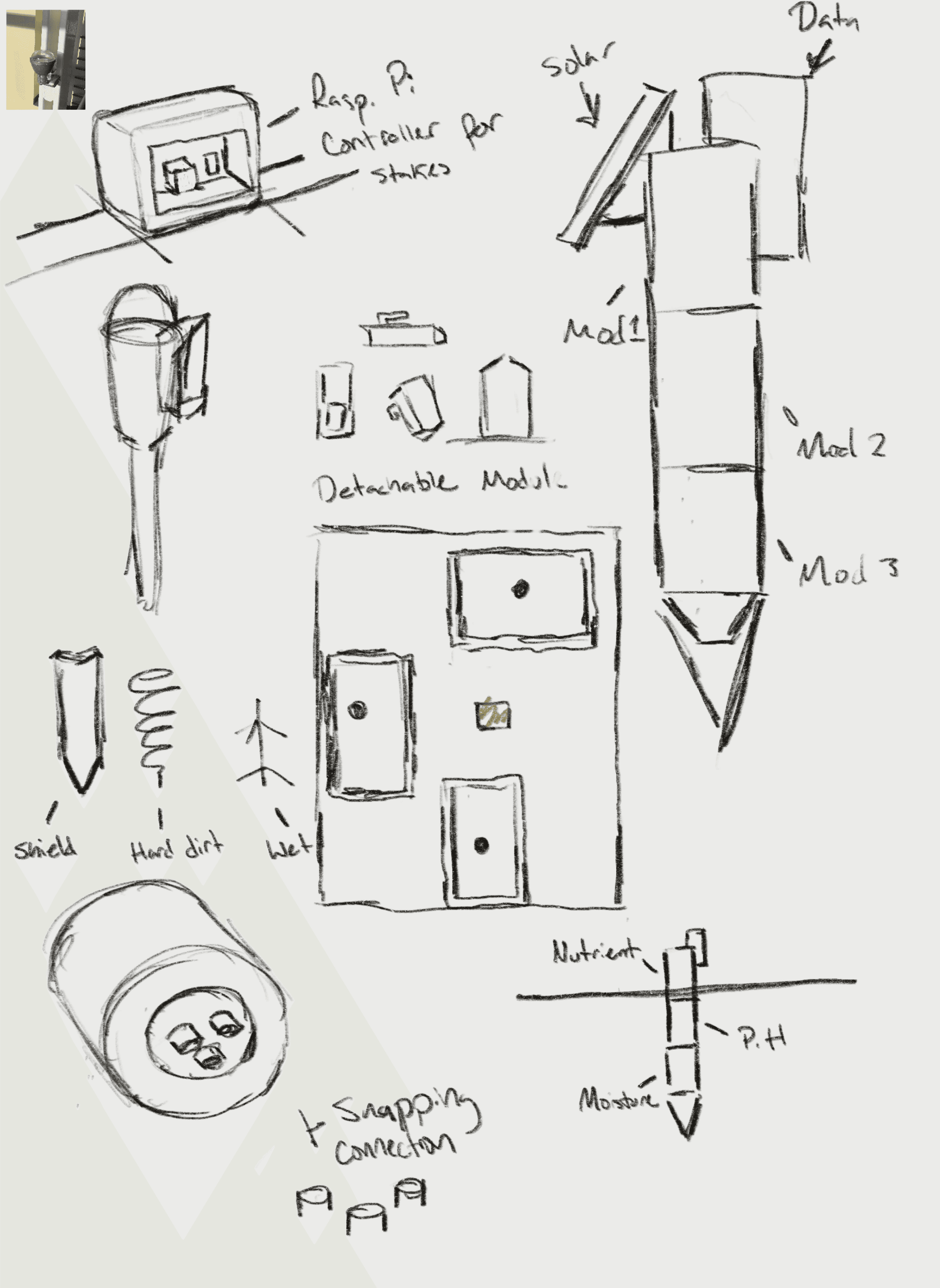
So I got to reworking the design, trying to stretch boundaries but still focus on being practical.
So there is 2 parts to the operation:
the Stakes and the Hub.
Stakes
The stake a simple ground stake end with a sensor housing body and a microcontroller (A super small computer) w/ an mini SD card.
And it’s not one whole piece, instead each sensor is a small piece of the body. you can mix and match the middle sensor bodies for your needs and still do your crucial needs (relaying data to the hub & planting inground).
Hub
The hub is a Raspberry PI (a small computer) that catches the data relayed to the hub. Its able to do the more advanced calculations and store data onboard. This hub can then send the data to the cloud, nearby computer, be remotely booted into.
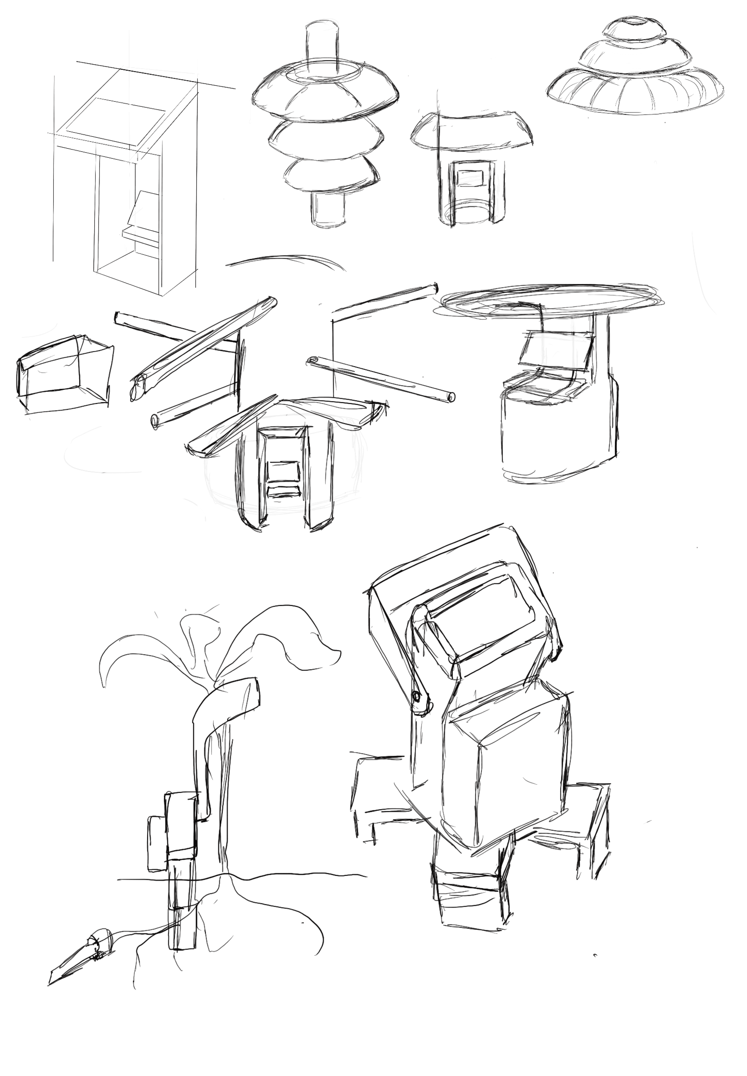
Other Explorations of the Hub and Stakes:
Thinking of a treehouse/call booth to for the hub, something to protect the computer from heat/rain but also a waypoint for easy access. Could potentially add a solar panel to make completely off grid and house a small cell tower for farther reach.
Ideating
Lo-Fi Wireframes
After getting confident in my requirements and sketching out ideas, I got to wire-framing. I figured out the user would need 3 main pages:
Dashboard
Data
Hardware
Dashboard Page
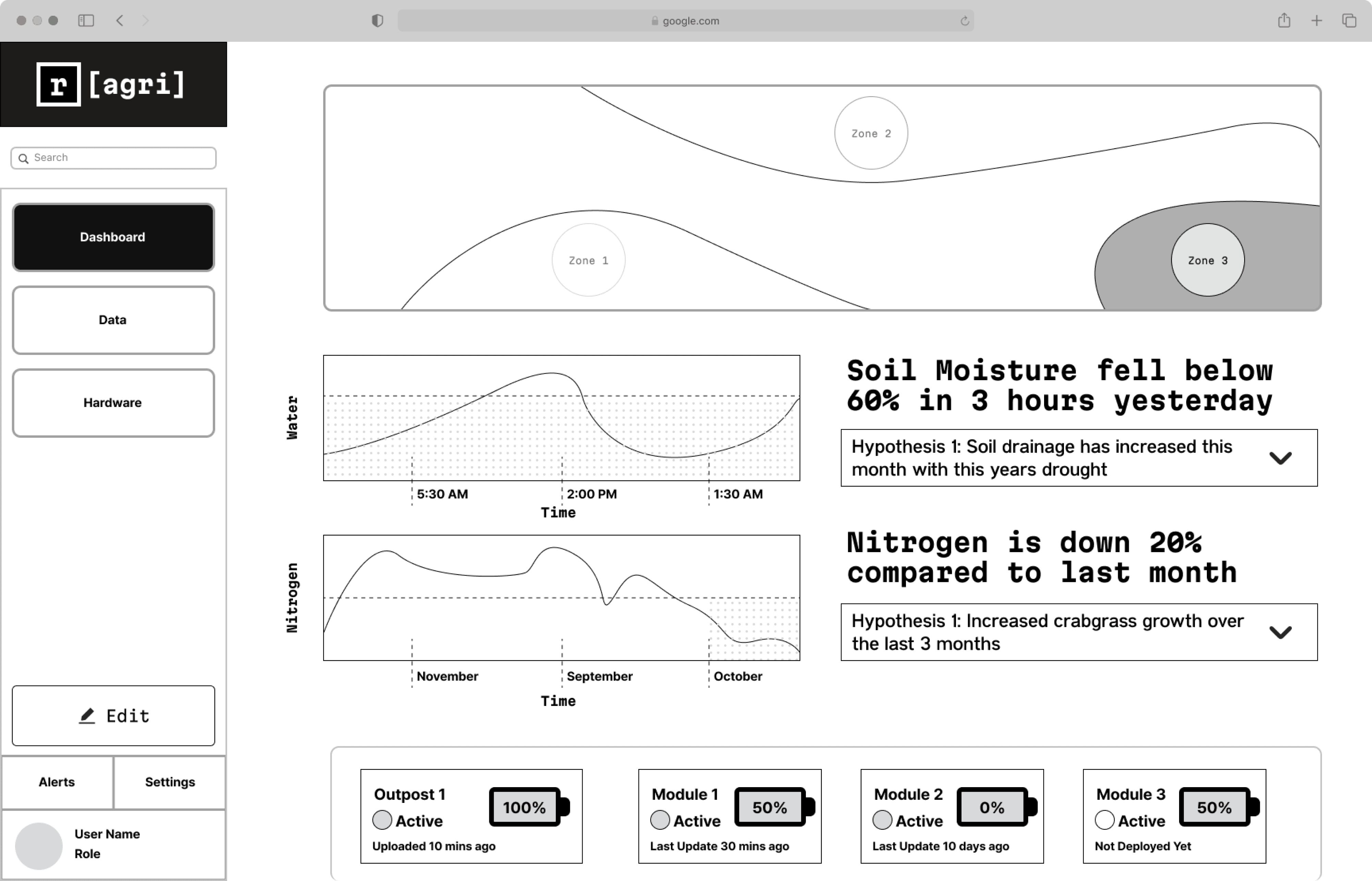
I knew this page was going to data heavy so I was trying to think of ways that the user could understand information at a glance. This came out in a few different ways but primarily the Synopsis feature
The platform would be using the sensor data to make inferences and give the user valuable insights that would take effort to find out. Letting the technology and data find the hidden connections and allowing the user to act decisively.
(Initial group: 2/6 (33.%) were satisfied with dashboard)
v.s
(Second group: 7/8 (87.5%) were satisfied with dashboard)
Data Page
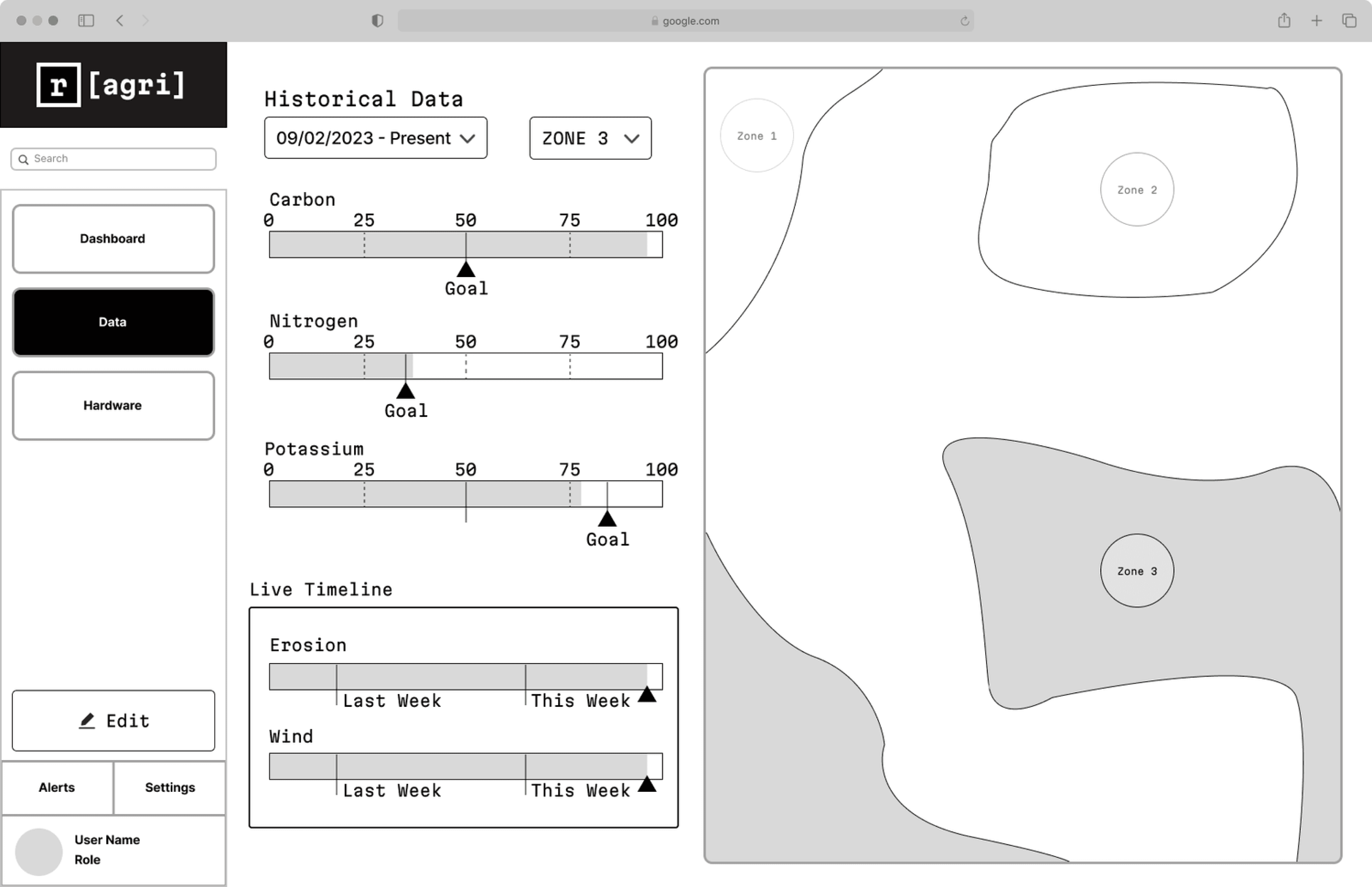
This page was actually where I designed first because it felt like the core of the app. But I had trouble starting, I had to rethink my approach a lot going into this. I asked myself:
What do people even use a data page for?
What were my users actually trying to do?
How would a normal person want to use the app?
My answer:
To see what’s working and what’s not
Efficiently set goals across their farm
Thus I added zone specific data to make it easier to track specific locations, in these zones you can set goals and track data changes on a timeline.
Having access to this helps lower the barrier to entry to making data-backed decisions and makes it much more user friendly to read updates v.s an spreadsheet or one off readouts.
(Initial group: 3/6 (50%) were satisfied with dashboard)
v.s
(Second group: 8/8 (100%) were satisfied with dashboard)
Hardware Page
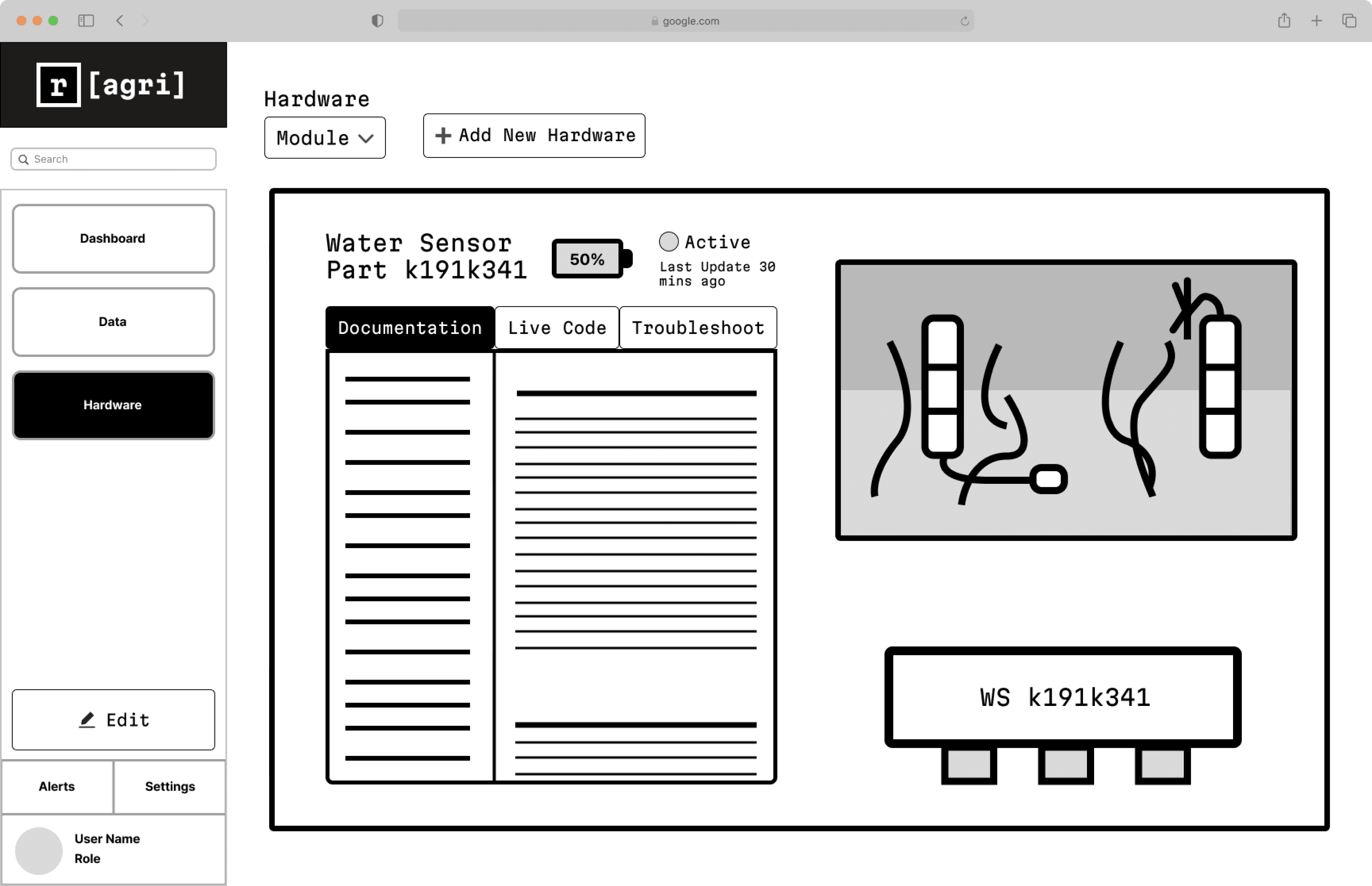
Honestly this page was the scariest because I’m not an engineer and I didn’t know what I was talking about at all. But after doing a lot of research (watching tons of youtube videos and asking ChatGPT when I was confused) I was able to come up some common requirements for hardware:
Add/edit added hardware
Track hardware sensor health/status
But there were some pain points I had found while doing my research.
Lack of easily understandable documentation
Fear/difficulty editing code
Lack of help with putting DIY/Open-Source project together
This all made it really difficult to work on projects to the point that it had become the norm, and I think that’s awful. So I tried adding features to ease that pain.
A place to edit code and deploy easily
A troubleshoot feature, to help figure out what went wrong in setup
And documentation, easily accessible, and ideally translated to layman language.
Really recommend Salim Benbouziyane’s channel if this stuff interests you at all
Link: https://www.youtube.com/watch?v=-QD0J8EfYqw
Refining
Branding/Design System
Before going any further I felt like I needed to get a solid understanding of the brand. The project is deeply routed in Open Source thinking and made for the people so I needed to show that. I wanted a colorful shell that anyone could pickup and customize to make their own, but not something soulless (Mission Impossible ik).
Design System
Because of the use case and lack of time it felt appropriate to use an open source design system. But I found that none of them on it’s own really fit my vision. So instead I used them (Ant & Apple) for inspiration and guidelines, while using Material Design icons for any icon needs.
Highly recommend Iconify plugin on Figma Community, so useful.



Logo
I had been sitting on the name for a while because I had wanted to do something community based in technology. I felt this was the perfect time due to it being an agriculture based project
Typography
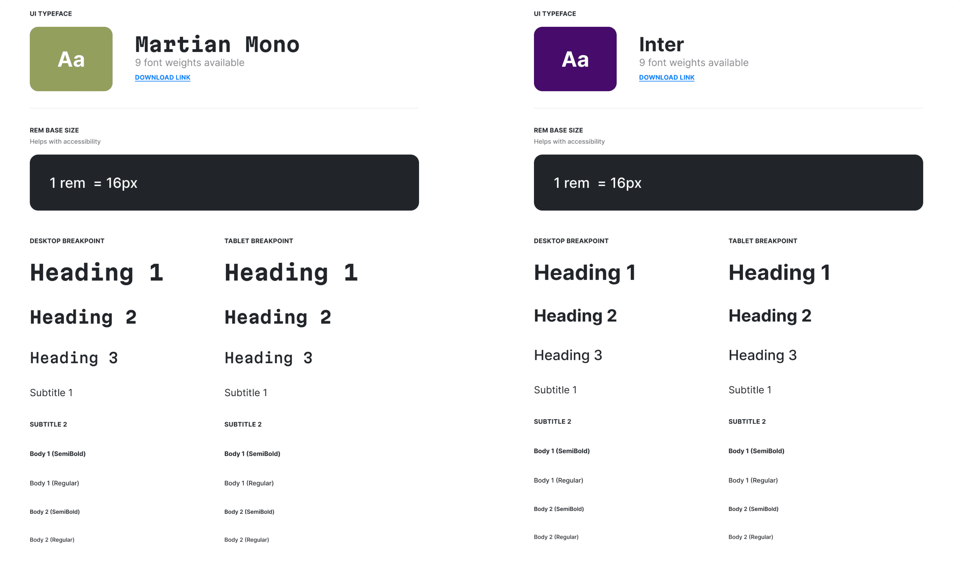
For the typography, I wanted the site to remind you of an old school terminal but have the clarity of a modern design. Thats why I was so happy to find Martian Mono, its striking type felt like a perfect representation of that. Paired with a simple and readable font like Inter, users would be able to enjoy the fun and actually read it to.
Hi-Fi Wireframes
After putting together my design system, I got to refining. Pulling out all of my learnings and applying my skills and resources to it. I organized tiers of solutions around the problem

A Focus on Quickly Understanding Information
Latest Updates
(N)
Nitrogen (N)
Currently at
August 23, 2023 @ 10 AM
(44.5 ppm)
(P)
Phosphorus (P)
Currently at
August 22, 2023 @ 10 AM
(67.4 ppm)
(N)
Potassium (K)
Currently at
August 22, 2023 @ 10 AM
(21.7 ppm)
Motion Detected in Bed 3 Spotted at Zone 2
August 21, 2023 @ 2 AM
View all
Quick View
Gives a status update on important goals and learnings that the system found. Clicking on them leads to a more detailed report.
Users would be looking for a quick way to get to know what happened while they were out. This quick view launches them straight into the important stuff.
Data Synopsis
Water retention is up compared to last September. Likely because of newly introduced cover mulch.
This improvement has increased growth by 23% with retention of Potassium at 9.5 ml per mb.
54%
Suggestion:
Add 1/2 inch of cover mulch and 1/2 inch of compost to Zone 2 - Bed 3
Water Retention
Water Retention This Past Year
80%
100%
60%
40%
20%
0
J
F
M
A
M
J
J
A
Time
View More
Data Synopsis
A quick synopsis of progress on an important goal. In it the card provides context and suggestions on the next step forward.
This card answers the question of
“Ok what now?”, by helping the user make inferences and decisions that backed by data and science.

Ask Sprout
Ask Sprout
A well informed helping hand, able to explain what’s going on at all times. An AI chatbot trained on agriculture datasets/best practices and fine-tuned to your farm.
Sprout is what would happen if your garden could speak to you. Able to tell you exactly what’s happening and why, users would be able to make sense of the chaos. They are available on every page for easy access.
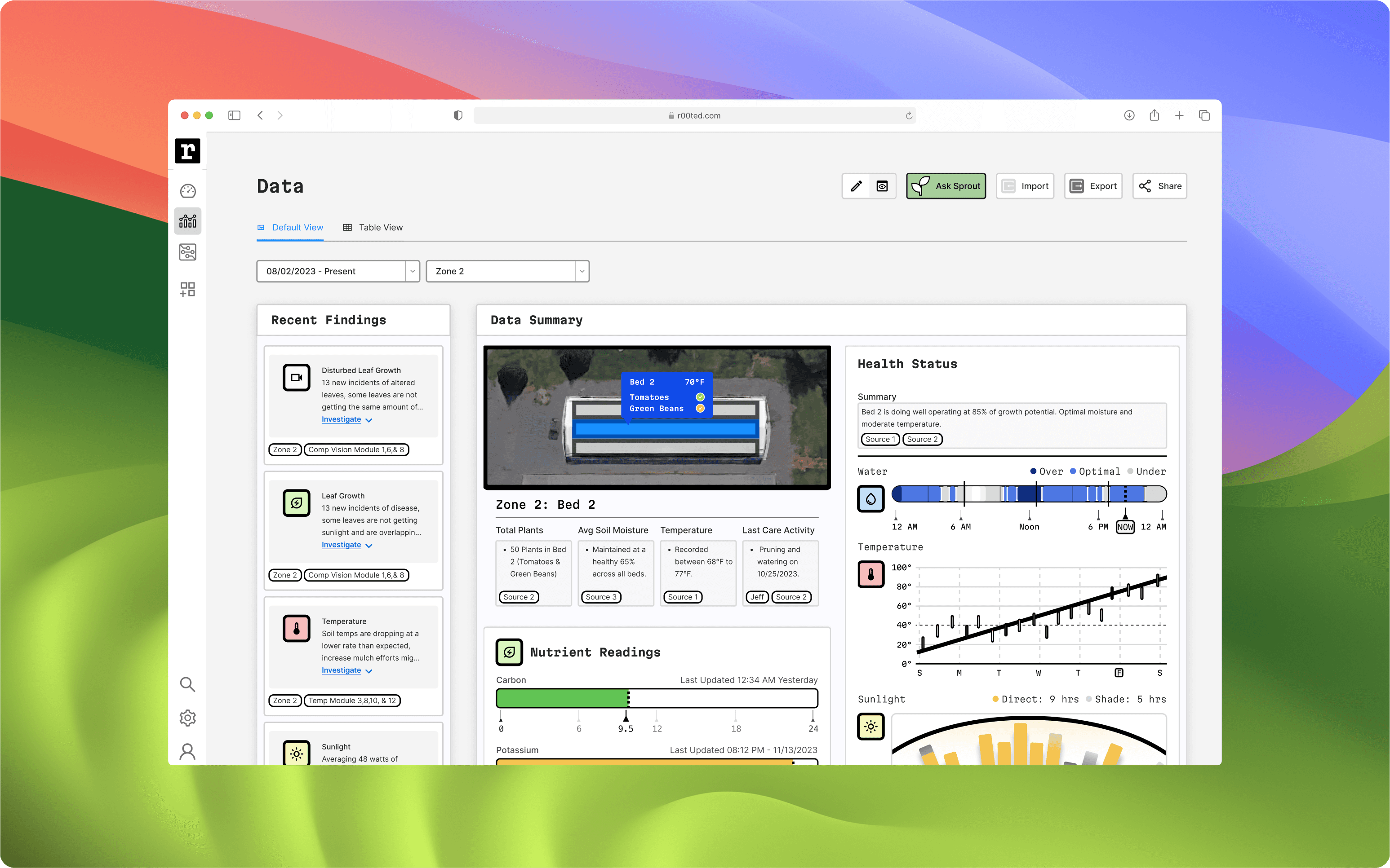
Where Data and Clarity Intersect
Disturbed Leaf Growth
13 new incidents of altered leaves, some leaves are not getting the same amount of...
Investigate
Zone 2
Comp Vision Module 1,6,& 8
Water Usage
Runoff rate of 34%, 56% lower than September.
Investigate
Zone 2
Water Module 3,8,10, & 12
Sunlight
Averaging 48 watts of sunlight every day this week
Investigate
Zone 2
Sun Module 1
Temperature
Soil temps are dropping at a lower rate than expected, increase mulch efforts mig...
Investigate
Zone 2
Temp Module 3,8,10, & 12
Sprout’s Leads
A collection of all of the recent learnings Sprout has come up with, these leads are based off data from your farm and allow you to research into the inference and make decisions
Recommendations
Identified Issue
Possible deficiency in phosphorus affecting plant growth.
Source 1
Source 2
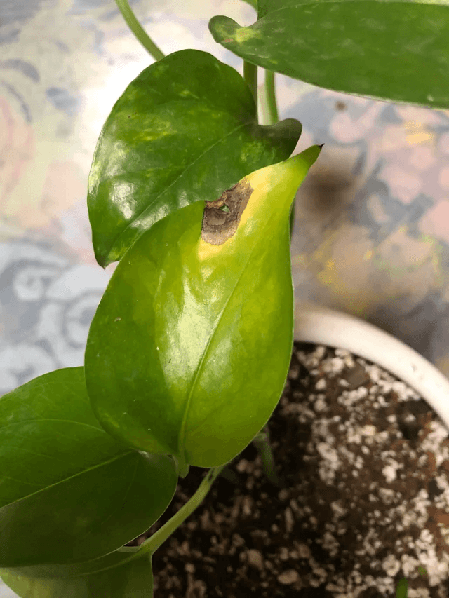
Image Source
Supporting Article
Symptoms
Stunted growth and discoloration of leaves observed in some plants.
Source 1
Source 2
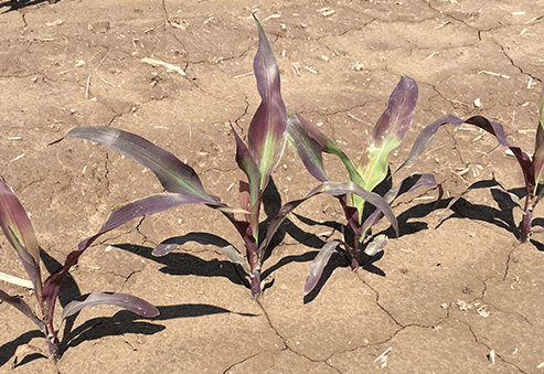
Image Source
Supporting Article
Solution 1:
Optimal
Add Phosphorus
Incorporate 4 lbs of organic phosphorus-rich organic matter into the soil.
Adjust nutrient mix in irrigation water to ensure adequate phosphorus levels.
Consider adding compost or bone meal to enhance phosphorus availability.
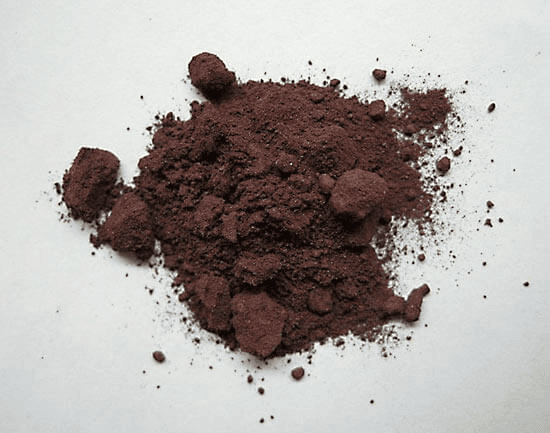
Image Source
Supporting Article
Sprout’s Recommendations
An evidence based set of solutions based on agriculture best practices and tuned to your land. Basically Sprout puts you in the driver seat on your
Nutrient Readings
Carbon
Last Updated 12:34 AM Yesterday
12
9.5
18
6
24
0
Potassium
Last Updated 08:12 PM - 11/13/2023
12
21.7
18
6
24
0
Nitrogen
Last Updated 04:58 AM - 11/18/2023
50
GOAL
9.5
75
25
100
0
Phosphorus (P)
Last Updated 08:12 PM - 11/13/2023
50
GOAL
9.5
75
25
100
0
Calcium (Ca)
Last Updated 12:34 AM Yesterday
50
GOAL
9.5
75
25
100
0
Magnesium (Mg)
Last Updated 04:58 AM - 11/18/2023
50
GOAL
89.1
75
25
100
0
Add More
Health Status
Summary
Bed 2 is doing well operating at 85% of growth potential. Optimal moisture and moderate temperature.
Source 1
Source 2
Water
Over
Optimal
Under
NOW
Temperature
80°
100°
60°
40°
20°
0°
S
M
T
W
T
F
S
Sunlight
Direct: 9 hrs
Shade: 5 hrs
Noon
6 PM
6 AM
Data Cards
Powerful customizable & interact-able charts that display your data easily
I took inspiration from the Apple Watch’s complications, I tried to make each chart understandable at a glance.
Editable Views
Every plot of land is different and every user’s needs are different so the product needs to lean into this.
By having a multiple views to explore and customize, the user can easily put together the exact information they need.
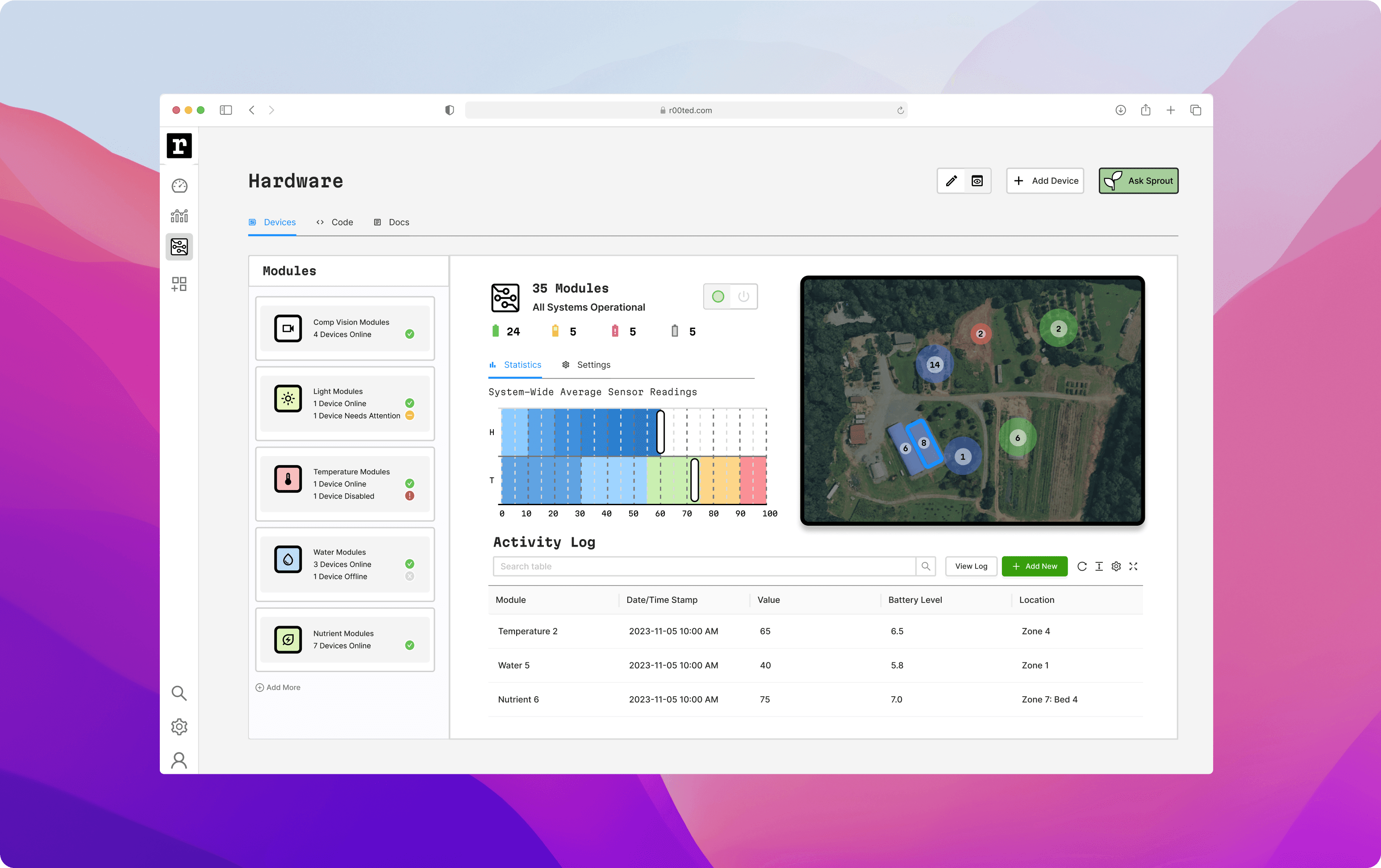
A Place of Learning and Full Control
Device Control Center
View all of the modules you have at your disposal. Control their status from here.
Add/remove modules, read their last update history, and edit their location
Integrated IDE
View all of the modules you have at your disposal. Control their status from here.
Add/remove modules, read their last update history, and edit their location
Documentation
View all of the modules you have at your disposal. Control their status from here.
Add/remove modules, read their last update history, and edit their location
Try It Here!
6. Retrospective
I learned a lot from this project and feel motivated to continue, especially with the physical aspect. Who knows, one day it might become a reality.
Data Visualization - for multiple new contexts and sizes
Got to practice my branding and design systems skills
Hardware and everything IOT, Arduino's - Rasp Pi
Thank you for reading!
Lets Work Together!
Email Me!
About
Resume

